1 - Data visualization page
This is a guide for creating a Data Visualization page for our example. The page includes interactive visual elements for showcasing data from a CSV file.
Importing the Dataset
To import the dataset, use the following Python code:
import pandas as pd

def get_data(path_to_csv: str):
    dataset = pd.read_csv(path_to_csv)
    dataset["Date"] = pd.to_datetime(dataset["Date"])
    return dataset

path_to_csv = "dataset.csv"
dataset = get_data(path_to_csv)
Visual Elements
Taipy introduces the concept of Visual elements, which are graphic objects shown on the client interface. You can use various visual elements such as a slider, a chart, a table, an input, a menu, etc. Check the list here. The syntax for adding a visual element is as follows:
<|{variable}|visual_element_name|param_1=param_1|param_2=param_2| ... |>
tgb.visual_element_name("{variable}", param_1=param_1, param_2=param_2, ...)
The inclusion of variable within "{...}" tells Taipy to show and use the
real-time value of variable. Rather than re-executing the entire script,
Taipy intelligently adjusts only the necessary elements of the GUI to reflect
changes, ensuring a responsive and performance-optimized user experience.
For example, to add a slider that modifies the value of the variable n_week, use the following syntax:
<|{n_week}|slider|min=1|max=52|>
tgb.slider("{n_week}", min=1, max=52)
To display a chart with the dataset's content, use the following syntax:
<|{dataset}|chart|type=bar|x=Date|y=Value|>
tgb.chart("{dataset}", type="bar", x="Date", y="Value")
You can also use Plotly Python to create a figure object and inject it in the chart:
from taipy.gui import Gui
import plotly.graph_objects as go

list_to_display = [100/x for x in range(1, 100)]
fig = go.Figure(data=go.Scatter(y=list_to_display))

page = "<|chart|figure={fig}|>"

Gui(page).run()
from taipy.gui import Gui
import taipy.gui.builder as tgb
import plotly.graph_objects as go

list_to_display = [100/x for x in range(1, 100)]
fig = go.Figure(data=go.Scatter(y=list_to_display))

with tgb.Page() as page:
    tgb.chart(figure="{fig}")

Gui(page).run()
Interactive GUI
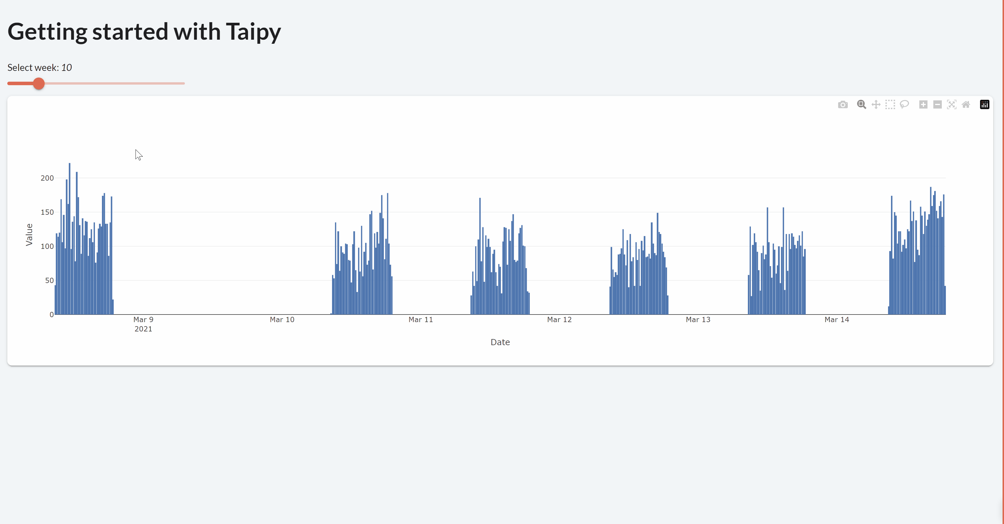
The Data Visualization page includes the following visual elements:
- A slider connected to the Python variable n_week.
- A chart representing the DataFrame content.
Multi-client - state
Taipy maintains a distinct state for every client connection. This state stores the values of all variables used in the user interface. For example, modifying n_week through a slider will update state.n_week, not the global Python variable n_week. Each client has its own state, ensuring that changes made by one client don't affect others.
Callbacks
Most visual element include callbacks, enabling you to modify variables according to user actions. For further details, explore local callbacks and global callbacks.
- state: The state object containing all the variables.
- The name of the modified variable. (optional)
- Its new value. (optional)
Here's an example of of setting the on_change callback function to update state.dataset_week based on the selected
week from the slider:
def on_slider(state):
    state.dataset_week = dataset[dataset["Date"].dt.isocalendar().week == state.n_week]
<|{n_week}|slider|min=1|max=52|on_change=on_slider|>
tgb.slider("{n_week}", min=1, max=52, on_change=on_slider)
Markdown
For this tutorial, we will only use the Markdown syntax. You can transform the Markdown
code to the Python API easily. The following Markdown corresponds to the
pages/data_viz/data_viz.md file. It is the entire Markdown of the first page.
# Data Visualization page

Select week: *<|{n_week}|>*

<|{n_week}|slider|min=1|max=52|on_change=on_slider|>

<|{dataset_week}|chart|type=bar|x=Date|y=Value|>
Python code (pages/data_viz/data_viz.py)
The following Python code corresponds to the pages/data_viz/data_viz.py file. It is the code
that complements the Markdown above. This code populates the objects on the page and creates the
connection between the slider and the chart.
from taipy.gui import Markdown
import pandas as pd

def get_data(path_to_csv: str):
    # pandas.read_csv() returns a pd.DataFrame
    dataset = pd.read_csv(path_to_csv)
    dataset["Date"] = pd.to_datetime(dataset["Date"])
    return dataset

# Read the dataframe
path_to_csv = "data/dataset.csv"
dataset = get_data(path_to_csv)

# Initial value
n_week = 10

# Select the week based on the slider value
dataset_week = dataset[dataset["Date"].dt.isocalendar().week == n_week]

def on_slider(state):
    state.dataset_week = dataset[dataset["Date"].dt.isocalendar().week == state.n_week]


data_viz = Markdown("pages/data_viz/data_viz.md")
Using this setup, you can construct an interactive Data Visualization page using Taipy. This page will showcase the dataset corresponding to the chosen week from the slider.