Charts for Large Data
This article aims to show how to minimize the volume of data transiting between the application and the GUI client without losing the information.

When we talk about Data, we refer to large Tabular data with plenty of columns and even more rows. If we consider a table (data frame, array, etc.) with just 20 columns and 500K rows, generating a graphical view for such a table will require over 1 minute on a 10MB/s network!
=
64 sec
If we manage to reduce "smartly" the number of points that define the shape of the plot/curve, we will get:
- A better network bandwidth (see above)
- Less memory used on the client side
- A more meaningful visual (client side) since the plot will involve a much lower number of data points.
- A much better user experience: when the end-user clicks on a point to perform some action, the graphical component has to seek which points amongst the whole dataset have been selected. With a reduced number of points, performance will improve drastically.
This work is wholly disconnected from data transformation, such as compression algorithms. It is known that HTTP/1.1 already supports data compression (see the Internet Engineering Task Force).
First level: dealing with curves (2D)
The basic "algorithm"
The first effort was to transform data (with hundreds of thousands of points or more) on the application side to a reduced form plotted as a curve visually equivalent to the complete data set. Such reduced form should not exceed the maximum resolution of the screen/frame (usually on the horizontal axis).
The process of "reducing" a dataset by eliminating "nonsignificant" points is generally referred to as "decimation" or "downsampling" (or even "subsampling").
Important: This implementation must allow the end-user to select (graphically) a different subset of the displayed curve with an automatic re-run of the "decimator algorithm". This will enable the "optimal" display of the data, whatever the zoom level is.
We evaluated three different algorithms:
- The Min-Max algorithm
- The LTTB algorithm
- The Ramer-Douglas-Peuker algorithm
Min-Max algorithm
Here is an example of code showing how to use the Min-Max Decimator:
import yfinance as yf
from taipy.gui import Gui
from taipy.gui.data.decimator import MinMaxDecimator, RDP, LTTB

df_AAPL = yf.Ticker("AAPL").history(interval="1d", period = "100Y")
df_AAPL["DATE"] = df_AAPL.index.astype('int64').astype(float)

NOP = 500
decimator_instance = MinMaxDecimator(n_out=NOP)

page = "<|{df_AAPL}|chart|x=DATE|y=Open|decimator=decimator_instance|>"

Gui(page).run(title="Decimator")
Let NOP be the desired number of points to be represented on the client side.
The Min-Max algorithm divides one of the dimensions into as many segments as the number of points (NOP).
For each segment, only the original dataset's two extreme points (on the second axis) are kept. Only the extreme values are kept.
Performance is excellent.
LTTB Algorithm
Here is an example of code showing how to use the LTTB Decimator:
import yfinance as yf
from taipy.gui import Gui
from taipy.gui.data.decimator import MinMaxDecimator, RDP, LTTB

df_AAPL = yf.Ticker("AAPL").history(interval="1d", period = "100Y")
df_AAPL["DATE"] = df_AAPL.index.astype('int64').astype(float)

NOP = 500
decimator_instance = MinMaxDecimator(n_out=NOP)

page = "<|{df_AAPL}|chart|x=DATE|y=Open|decimator=decimator_instance|>"

Gui(page).run(title="Decimator")
This algorithm is also referred to as "Largest Triangle Three Buckets".
This algorithm forms triangles between adjacent points to decide the relative importance of these points. This is a technique used often in cartography. Several LTTB implementations are available in Python.
The performance of this downsampling algorithm is also excellent.
The Ramer-Douglas-Peucker Algorithm
Here is an example of code showing how to use the Ramer-Douglas-Peucker Decimator:
import yfinance as yf
from taipy.gui import Gui
from taipy.gui.data.decimator import MinMaxDecimator, RDP, LTTB

df_AAPL = yf.Ticker("AAPL").history(interval="1d", period = "100Y")
df_AAPL["DATE"] = df_AAPL.index.astype('int64').astype(float)

NOP = 500
decimator_instance = RDP(n_out=NOP)

page = "<|{df_AAPL}|chart|x=DATE|y=Open|decimator=decimator_instance|>"

Gui(page).run(title="Decimator")
This algorithm uses an entirely different approach. It seeks "important" points in
the initial/large datasets. These important points are points that, if removed,
drastically modify the shape of the curve. Another way to put it is that this algorithm
removes all the points that least alter the shape of the curve.
More information can be found in the seminal paper:
"The Douglas-Peucker Algorithm for Line Simplification". M. Visvalingam & J. D. Whyatt, 1990.
Then, an improved version of the algorithm:
"Line generalization by repeated elimination of points". M. Visvalingam & J. Whyatt, 1993.
Performance is not as good as the previous ones, but the quality of the results (as demonstrated below) is much better.
Second level: dealing with a cloud of points (3D or more)
The previous algorithms are well suited for 2D curves. Still, they are not satisfactory to higher dimension visuals. If several data points of the original dataset get projected in the same space, they would be removed if the previous algorithms were used. Here, the density of the points needs to be represented. We developed a specific algorithm using the following approach:
- We divide the representation space (client side) into a mesh space.
- We minimize the number of points projected in the same cell (of the mesh)
- We ensure that cells with a single point are preserved.
Results
Presenting here quantitative results, in terms of time or memory saved, when applying adaptive optimization algorithms is not very useful. Indeed, the achieved performance improvements are closely related to three independent factors: the computational power of the application server and its available memory, the network bandwidth connecting the server to the client, and the client side itself, where the type of browser also comes into play.
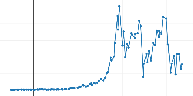
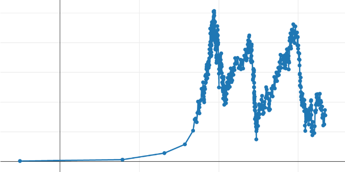
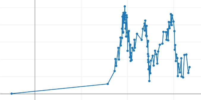
On the other hand, a commented visualization of the results obtained can be interesting. Here is a typical curve in front of which a data analyst should make decisions:
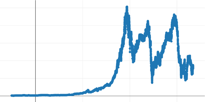
This curve is the result of sampling an anonymous dataset and contains more than 15,000 points. Its display is performed by a thin line connecting markers at each point representing a sample. We chose this dataset because it includes several types of progressions that will interest us in judging the results: an area where the data progresses slowly, more abrupt variations, and local disturbances. All points are represented in the above curve, and we will apply our algorithms to these data to judge the visual quality of decimation- how satisfactory the result is and at what cost.
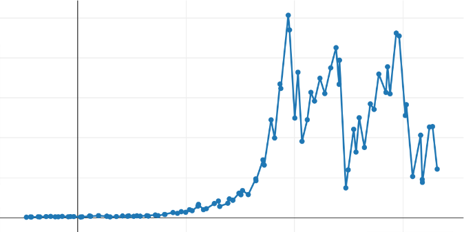
For each of the selected algorithms, we decimated the initial dataset by setting the number of output points to:
- 500, to visually compare the shapes of the curves and check the approximation's satisfaction. This number of curve definition points seems consistent with the intended use, occupying between half and one-third of the common horizontal screen resolutions.
- 100, to visually account for how the algorithm behaves in different regions of the original curve. The degradation is considerable and unacceptable in the context of an application.
Min-Max Algorithm
Here is the result of executing this algorithm on the initial dataset:
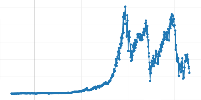
We can observe that the overall appearance of the curve is well preserved, as we hoped. An obvious drawback is visible on the low-quality curve: the uniform segmentation of the axis causes a kind of waste of output points at the beginning of the curve, where slight variation is visible.
LTTB Algorithm
If we execute this algorithm on our dataset, we obtain the following curves:
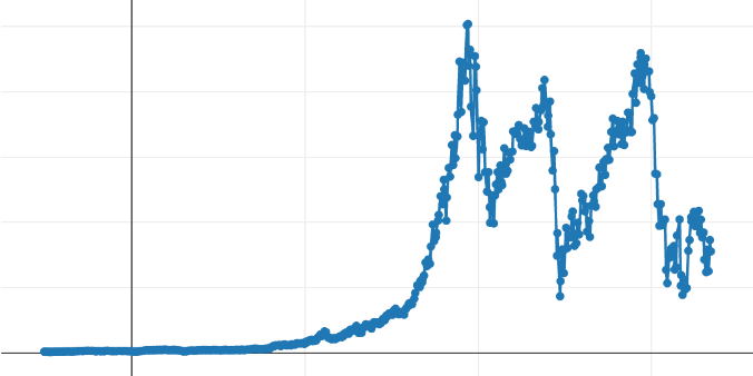
We can observe (on the low-quality curve) the same problem on the left part of the curve. This is not surprising since the surface of the evaluated triangles will increase with the abscissa spacing, retaining potentially non-significant points. On the other hand, we can see greater precision in the part where values increase rapidly (first peak): both local peaks are well preserved, whereas the Min-Max eliminated one of the two.
Ramer-Douglas-Peucker Algorithm
The third algorithm gives the following curves:
This time, it is clear that the left part of the curve (with its low variability) is approximated by one or two segments, which seems optimal. This allows "saving" additional points to better define the rest of the produced curve. The performance of this algorithm is significantly worse than for the two algorithms described above but potentially more 'precise' concerning the shape of the curve. Unlike the two previous algorithms, in its original form, this algorithm does not start from the target number of points to obtain as output. It uses a threshold value ('epsilon') beyond which we consider that a segment deviates angularly too much from the previous one, causing the selection of its destination point to be 'significant'.
A modified form of this algorithm is needed if one wants to impose a target number of points (like the other algorithms). A pre-processing phase, which is more costly, is required.
Performance
As we have already mentioned, providing absolute performance speed would not be very useful, as the execution conditions of our algorithms can vary drastically. However, relative performance speed can be helpful. Here they are:
- Min-Max: 1 (reference value)
- LTTB: 10 x
- Ramer-Douglas-Peucker (using the 'epsilon' threshold): 20 x
- Ramer-Douglas-Peucker (using a fixed number of points): 800 x
Conclusion
Taipy offers the possibility to apply or not a decimation algorithm. A developer can choose which algorithm to use and with what parameters. If this algorithm is to impact the application's performance too much, it is always possible to fine-tune these parameters.
In the case where the end-user zooms in or out or scrolls the curve, the server must calculate the new data entirely represented. It is essential, then, that the developer understands the consequences of his choices in terms of:
- manipulated data volume,
- the parameters of each decimation algorithm.