COVID Dashboard
This demo visualizes a Covid dataset for the year 2020. Pages show different graphs and information on Covid. A Prediction page is also present to predict the number of casualties.
Understanding the Application
The application comprises four pages accessible via the upper tabs: Country, Map, Predictions, World.
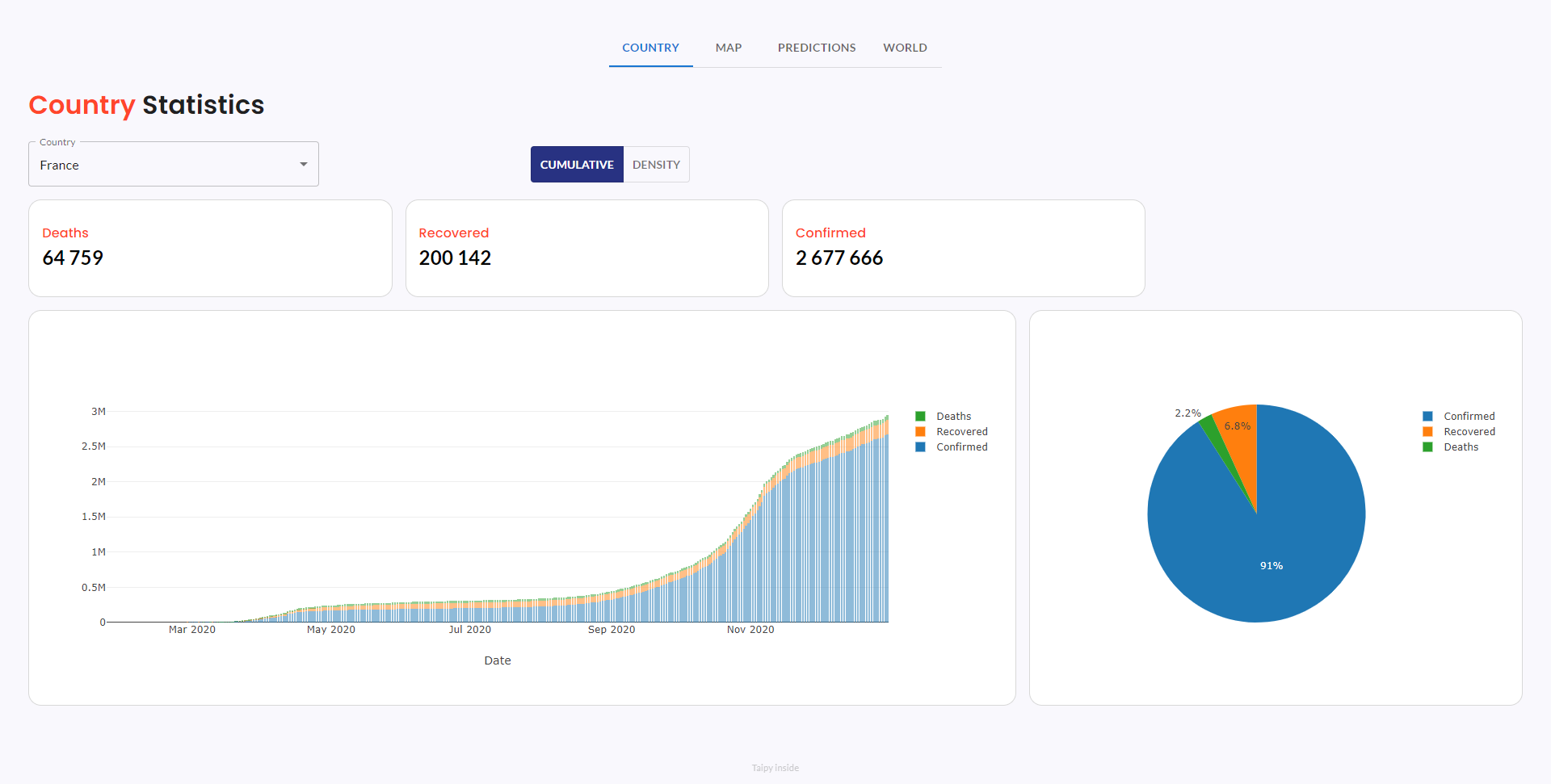
Page 1: Country
- Country-specific COVID-19 statistics.
- Easily switch between cumulative and density data views.
- Interactive bar chart for dynamic data exploration.
- Pie chart illustrating case distribution (Confirmed, Recovered, Deaths).
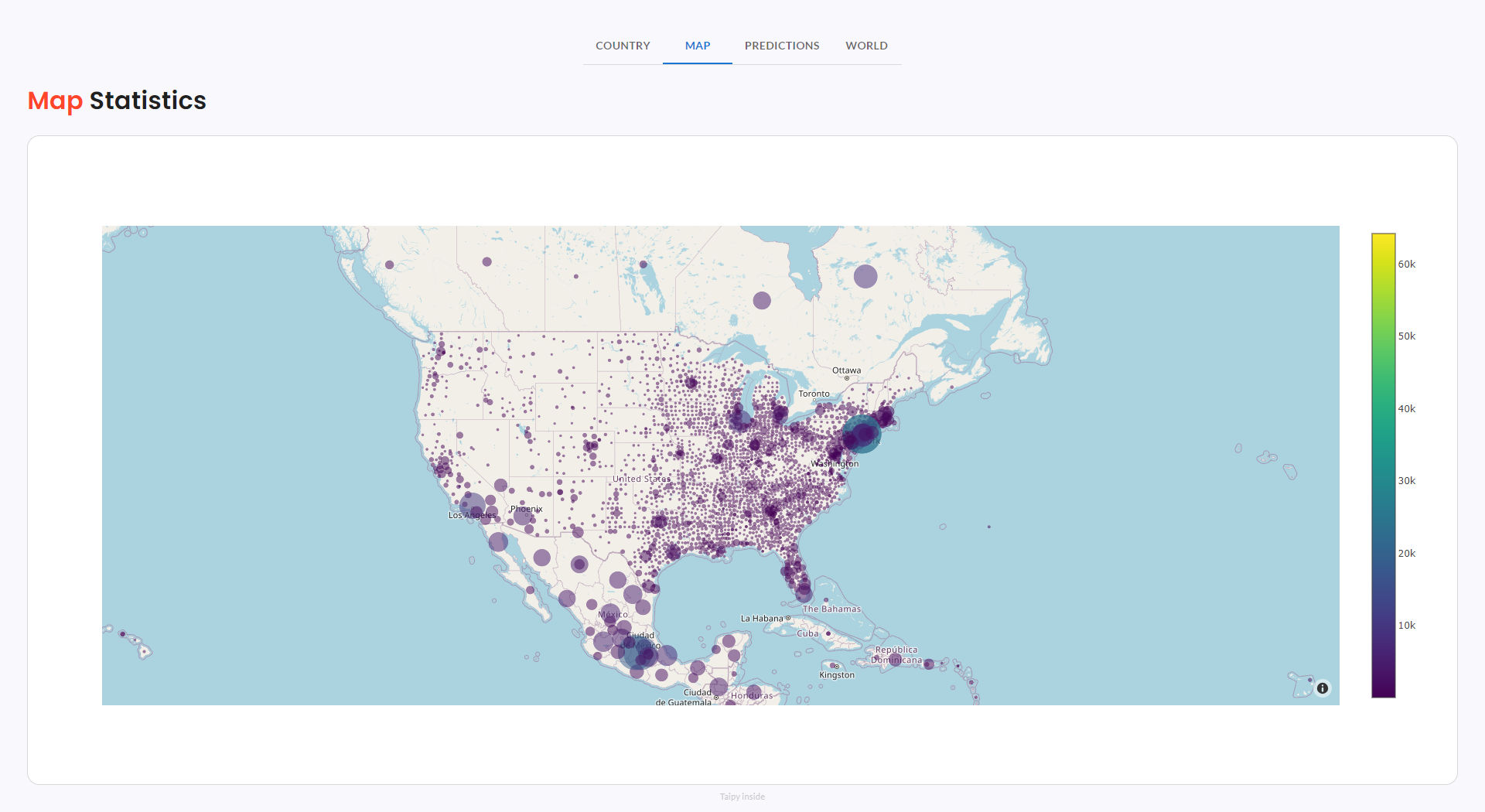
Page 2: Map
Visual representation of COVID-19 impact through dynamic zoomable color-coded maps.
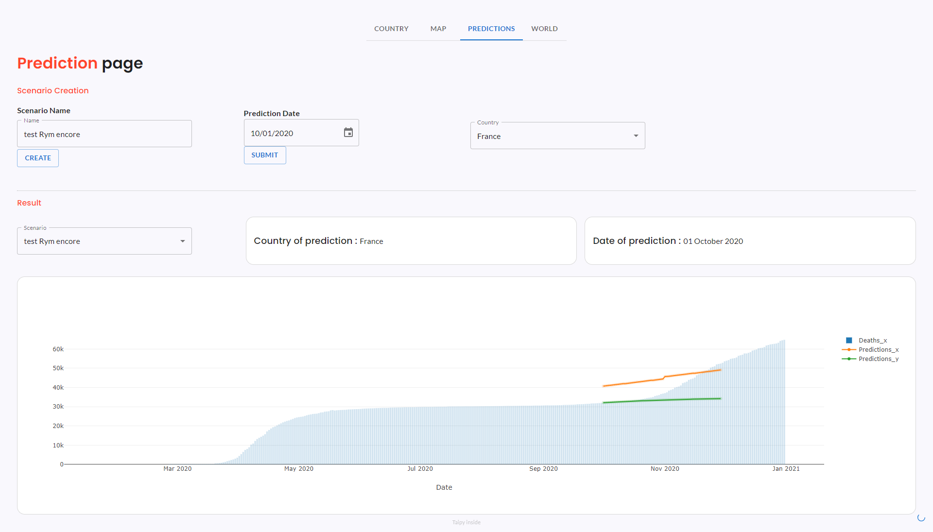
Page 3: Predictions
Generate COVID-19 predictions by creating scenarios for different prediction dates and different countries. This generates two different predictions (prediction_x in orange and prediction_y in green) using respectively an ARIMA model and a Linear Regression model.
How to use it:
- Initiate a new scenario by assigning it a name.
- Specify a prediction date.
- Choose a country.
- Click the "Submit" button and here we go!
- To view your scenario, access it in the Scenario tab located within the Results section.
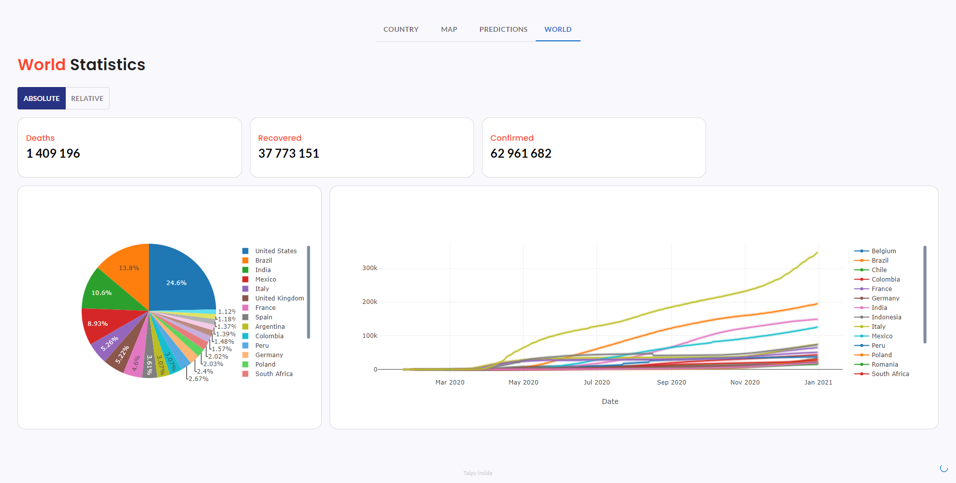
Page 4: World
Global COVID-19 statistics are summarized via line and pie charts. The Comparison of Covid countries' impact can be seen by changing the toggle between ‘Absolute’ and ‘Relative’.