4 - Charts
Download Step 4 Download the entire code
For Notebooks
The Notebook is available here. In Taipy GUI, the process to execute a Jupyter Notebook is different from executing a Python Script.
Charts are an essential part of Taipy (and of any Web application!). A chart is just another visual element with many properties to customize it.
Here is one of the simplest code to create a chart:
list_to_display = [100/x for x in range(1, 100)]
Gui("<|{list_to_display}|chart|>").run()
list_to_display = [100/x for x in range(1, 100)]
with tgb.Page() as page:
    tgb.chart("{list_to_display}")
Different formats can be passed to a chart element: a list, a Numpy array, or a Pandas Dataframe.
You can also use Plotly Python to create a figure object and inject it in the chart:
from taipy.gui import Gui
import plotly.graph_objects as go

list_to_display = [100/x for x in range(1, 100)]
fig = go.Figure(data=go.Scatter(y=list_to_display))

page = "<|chart|figure={fig}|>"

Gui(page).run()
from taipy.gui import Gui
import taipy.gui.builder as tgb
import plotly.graph_objects as go

list_to_display = [100/x for x in range(1, 100)]
fig = go.Figure(data=go.Scatter(y=list_to_display))

with tgb.Page() as page:
    tgb.chart(figure="{fig}")

Gui(page).run()
Different useful properties
Taipy charts are based on Plotly charts. More than any other visual element, charts have a lot of properties.
Here are a few of the essential properties. You can also look at the documentation for more information. - x and y are used to define the axis of the chart. Note that even if data inside columns are dynamic, the name of columns to display in a chart are not.
data = {"x_col": [0, 1, 2], "y_col1": [4, 1, 2]}
Gui("<|{data}|chart|x=x_col|y=y_col1|>").run()
data = {"x_col": [0, 1, 2], "y_col1": [4, 1, 2]}
with tgb.Page() as page:
    tgb.chart("{data}", x="x_col", y="y_col1")
- x and y can be indexed to add more traces to the chart:
data = {"x_col": [0, 1, 2], "y_col_1": [4, 2, 1], "y_col_2": [3, 1, 2]}
Gui("<|{data}|chart|x=x_col|y[1]=y_col_1|y[2]=y_col_2|>").run()
data = {"x_col": [0, 1, 2], "y_col1": [4, 1, 2], "y_col_2": [3, 1, 2]}
with tgb.Page() as page:
    tgb.chart("{data}", x="x_col", y__1="y_col1", y__2="y_col_2")
- Taipy provides a lot of different options to customize graphs. color is one of them:
data = {"x_col": [0, 1, 2], "y_col_1": [4, 2, 1], "y_col_2":[3, 1, 2]}
Gui("<|{data}|chart|x=x_col|y[1]=y_col_1|y[2]=y_col_2|color[1]=green|>").run()
data = {"x_col": [0, 1, 2], "y_col1": [4, 1, 2], "y_col_2": [3, 1, 2]}
with tgb.Page() as page:
    tgb.chart("{data}", x="x_col", y__1="y_col1", y__2="y_col_2", color__1="green")
Different types of charts
Different types are available: maps, bar charts, pie charts, line charts, and 3D charts, ... To know how to use them quickly, types are listed here. If compatible, two types like scatter, line_, and bar can also be used together on the same chart.
data = {"x_col": [0, 1, 2], "y_col_1": [4, 1, 2], "y_col_2": [3, 1, 2]}
Gui("<|{data}|chart|x=x_col|y[1]=y_col_1|y[2]=y_col_2|type[1]=bar|>").run()
data = {"x_col": [0, 1, 2], "y_col1": [4, 1, 2], "y_col_2": [3, 1, 2]}
with tgb.Page() as page:
    tgb.chart("{data}", x="x_col", y__1="y_col1", y__2="y_col_2", type__1="bar")
Code
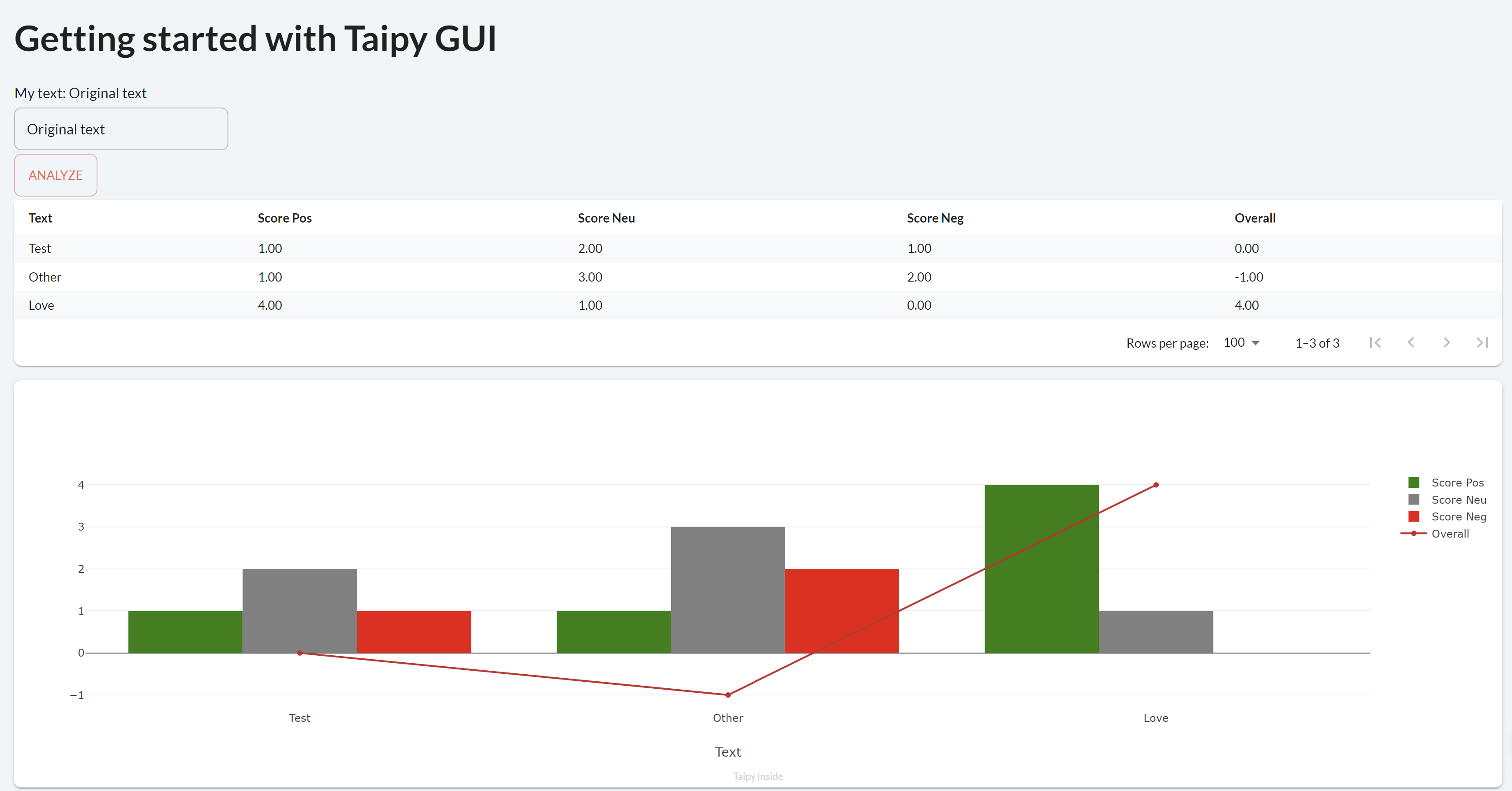
A chart is added to our code to visualize the score given by our NLP algorithm to different lines.
page = """
... put the previous Markdown page here

<|{dataframe}|table|>

<|{dataframe}|chart|type=bar|x=Text|y[1]=Score Pos|y[2]=Score Neu|y[3]=Score Neg|y[4]=Overall|color[1]=green|color[2]=grey|color[3]=red|type[4]=line|>
"""


dataframe = pd.DataFrame({"Text":['Test', 'Other', 'Love'],
                          "Score Pos":[1, 1, 4],
                          "Score Neu":[2, 3, 1],
                          "Score Neg":[1, 2, 0],
                          "Overall":[0, -1, 4]})
with tgb.Page() as page:
    ...

    tgb.table("{dataframe}")
    tgb.chart("{dataframe}", type="bar", x="Text",
              y__1="Score Pos", y__2="Score Neu", y__3="Score Neg", y__4="Overall",
              color__1="green", color__2="grey", color__3="red", type__4="line")


dataframe = pd.DataFrame({"Text":['Test', 'Other', 'Love'],
                          "Score Pos":[1, 1, 4],
                          "Score Neu":[2, 3, 1],
                          "Score Neg":[1, 2, 0],
                          "Overall":[0, -1, 4]})
Quick tip to write visual elements
To make coding easier, each visual element has a property called properties that you can directly set to a Python dictionary of properties. To recreate the graph shown above, you can to the following:
property_chart = {"type": "bar",
                  "x": "Text",
                  "y[1]": "Score Pos",
                  "y[2]": "Score Neu",
                  "y[3]": "Score Neg",
                  "y[4]": "Overall",
                  "color[1]": "green",
                  "color[2]": "grey",
                  "color[3]": "red",
                  "type[4]": "line"
                }

page = """
...
<|{dataframe}|chart|properties={property_chart}|>
...
"""
property_chart = {"type": "bar",
                  "x": "Text",
                  "y[1]": "Score Pos",
                  "y[2]": "Score Neu",
                  "y[3]": "Score Neg",
                  "y[4]": "Overall",
                  "color[1]": "green",
                  "color[2]": "grey",
                  "color[3]": "red",
                  "type[4]": "line"
                }

...
tgb.chart("{dataframe}", properties=property_chart)