Waterfall charts
Waterfall charts can display a running total as values are added or subtracted. They are used to rapidly understand how an initial value is affected by a series of positive or negative changes.
A typical use of waterfall charts shows how a net value is reached through gains and losses over time.
To create a waterfall chart in Taipy, you must set the type property of the chart control to "waterfall".
Key properties
| Name | Value | Notes |
|---|---|---|
| type | waterfall |
|
| x | x values. | |
| y | y values. | Absolute or relative. |
| measure | Type of value in y. | Valid values are "absolute" or "relative". |
| options | dictionary | increasing can be used to customize how boxes representing increasing values (positive y values) are displayed.decreasing can be used to customize how boxes representing decreasing values (negative y values) are displayed.connector can be used to customize the graphical properties of the lines connecting the boxes. |
Examples
Simple waterfall chart
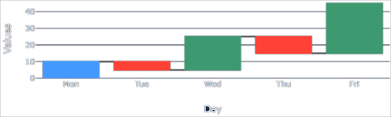
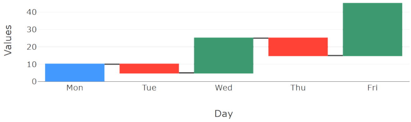
You can download the entire source code used in this section from the GitHub repository.Waterfall charts are typically used for describing cash flow: the initial value of some deposit and how it evolves with time.
Here is a dataset that could represent such a flow:
data = {
    "Day":   ["Mon", "Tue", "Wed", "Thu", "Fri"],
    "Values": [10, -5, 20, -10, 30],
}
The first item of the "Values" array indicates the initial amount in the account (10, in this example). That value is associated with the first item of the "Day" array that contains successive day names.
The waterfall chart needs to know if values are absolute or relative. To specify that, we need an additional array that is used as the measure property for the chart:
data = {
    ...
    "Measure": ["absolute", "relative", "relative", "relative", "relative"]
}
The "Measure" array indicates that all values except for the first must be considered relative (adding to or subtracting from the preceding running total).
Here is how the chart control could be defined:
Definition
<|{data}|chart|type=waterfall|x=Day|y=Values|measure=Measure|>
<taipy:chart type="waterfall" x="Day" y="Values" measure="Measure">{data}</taipy:chart>
import taipy.gui.builder as tgb
...
tgb.chart("{data}", type="waterfall", x="Day", y="Values", measure="Measure")
And here is how the resulting chart would look:
Styling
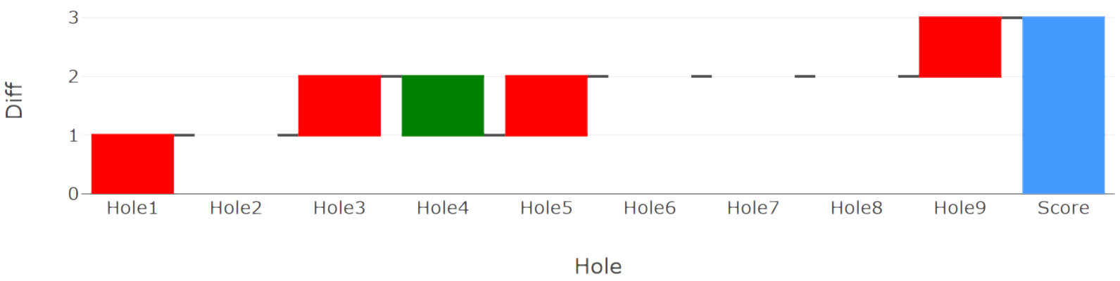
You can download the entire source code used in this section from the GitHub repository.By default, waterfall charts display values that increase the total with a green box. Red boxes
are used to represent values that decrease the current total.
There are use cases, however, when this default setting does not fit your usage, such as in the
game of golf: the fewer hits, the better. Therefore, to display the result of playing a round of
golf, we would want to use the red color for higher scores and the green color for lower
scores.
This is where styling comes in handy.
Here is a dataset that represents the score achieved on a 9-hole golf course:
n_holes = 9

data = {
    # ["Hole1", "Hole2", ..., "Hole9"]
    "Hole": [f"Hole{h}" for h in range(1,n_holes+1)] + ["Score"],
    # Par for each hole
    "Par": [ 3, 4, 4, 5, 3, 5, 4, 5, 3 ] + [None],
    # Score for each hole
    "Score": [ 4, 4, 5, 4, 4, 5, 4, 5, 4 ] + [None],
}
The "Par" array represents the expected number of ball hits to complete a given hole.
The "Score" array stores the number of strokes that were performed to complete the round.
Note that two None values are added to both arrays after the n_holes first values because this last "value" will not be used in our example. Instead, at the location of this "10th hole" bar, we want to display the running total: the cumulative difference between the actual score and the par for each hole. All those differences are stored in another array that we store in the data dictionary:
data["Diff"] = [data["Score"][i]-data["Par"][i] for i in range(0,n_holes)] + [None]
For each hole, we compute the difference between the actual score and the par (a value of -2,
for example, is a "birdie" in golf jargon: two hits under par). We then set the entire array of
differences, with an additional None value, to the dataset used by the chart, associated with the
key "Diff".
This array will be the value represented by our chart, showing, for each hole, the score relative
to the par. To indicate how to represent this array, we must add to the data dataset the measure:
data = {
    ...
    "M": n_holes * [ "relative" ] + ["total"]
}
All the values are represented as relative values (to the par) except for the last one that shows the final score: how good or bad the final score was, compared to the par.
To style a waterfall chart, you need to set the options property to a dictionary that specifies the graphical attributes to apply to the different elements of the chart. You can find the complete list of the settings that can be applied to a waterfall chart in the Waterfall charts in Plotly page.
Here is how we can style our chart to get the colors of the boxes to reflect the real meaning of the scores. A dictionary must be created with the appropriate keys associated with values that indicate what style should be applied to the chart:
options = {
    "decreasing": {
        "marker" : { "color": "green" }
    },
    "increasing": {
        "marker" : { "color": "red" }
    }
}
The "decreasing" and "increasing" keys hold dictionaries that define the color that must be used when displaying the chart boxes.
Here is the complete definition of the chart:
Definition
<|{data}|chart|type=waterfall|x=Hole|y=Diff|measure=M|options={options}|>
<taipy:chart type="waterfall" x="Hole" y="Diff" measure="M" options="{options}">{data}</taipy:chart>
import taipy.gui.builder as tgb
...
tgb.chart("{data}", type="waterfall", x="Hole", y="Diff", measure="M", options="{options}")
And here is what the resulting chart looks like:

Hierarchical timeline
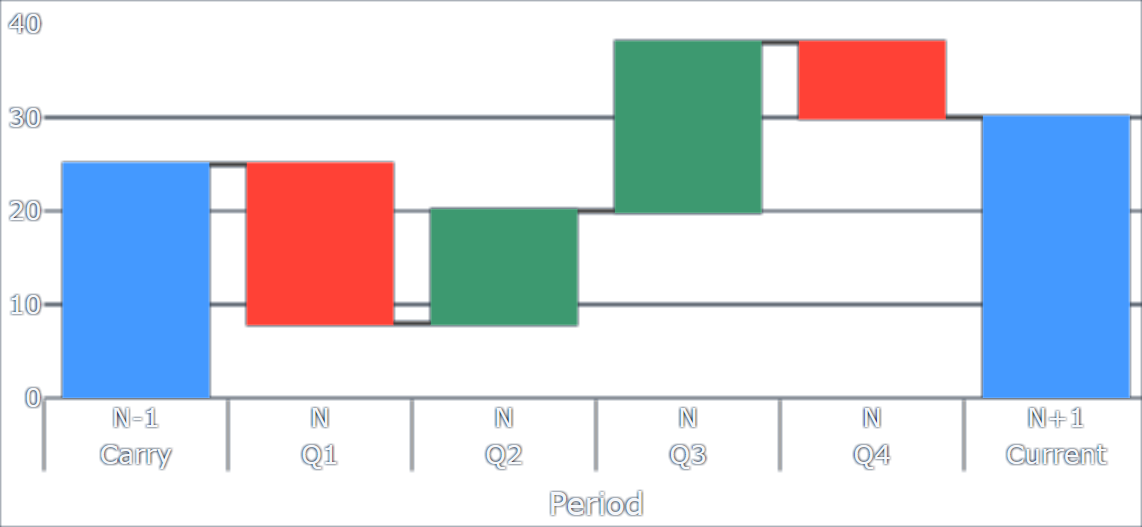
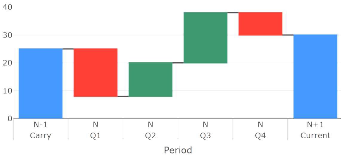
You can download the entire source code used in this section from the GitHub repository.Waterfall charts are often used to show variations of some quantity that happen at a given time in a given period. It is very useful to allow for grouping periods in larger buckets, to clarify the reading of the timeline.
A typical case is the representation of a company's revenue stream, which is looked at quarterly. We want to group all the quarters of the same year in the same slot and make the timeline very easy to read.
To achieve this with Taipy GUI, you need to create a slightly more complex dataset than in the examples above:
data = [
    {
        # The quarterly periods are grouped by year
        "Period": [
            ["Carry", "Q1", "Q2", "Q3", "Q4", "Current"],
            ["N-1",   "N",  "N",  "N",  "N",  "N+1"]
        ]
    },
    {
        "Cash Flow": [25, -17, 12, 18, -8, None],
        "Measure": ["absolute", "relative", "relative", "relative", "relative", "total"]
    }
]
The data used by the chart control must be split in two because the data for the timeline is itself an array.
The "Period" key of data is an array of two arrays of the same size, describing the hierarchy of the timeline periods. This is referred to as "0/Period" by the chart control.
"Cash Flow" and "Measure" hold the values and measure types for the waterfall definition. The chart
control refers to these with the "1/" prefix.
Note that we use the three types of measurements in the "Measure" array: we set the initial value
as an absolute value, then variations as relative, and the final value, which appears as a None
value in the "Cash Flow" array, is measured as a total. The chart will do the math for you.
The definition of the chart control is straightforward:
Definition
<|{data}|chart|type=waterfall|x=0/Period|y=1/Cash Flow|measure=1/Measure|>
<taipy:chart type="waterfall" x="0/Period" y="1/Cash Flow" measure="1/Measure">{data}</taipy:chart>
import taipy.gui.builder as tgb
...
tgb.chart("{data}", type="waterfall", x="0/Period", y="1/Cash Flow", measure="1/Measure")
The resulting chart looks like this: