Funnel charts
Funnel charts represent series of decreasing values as shrinking stacked bars.
Funnel charts are typically used:
- To visualize the changed value at each stage of a process.
- To estimate a potential figure at every stage.
- To track conversion and retention rates.
- To reveal bottlenecks in a linear process.
- To track shopping cart workflows.
- To track the progress and success of click-through advertising and marketing campaigns.
To create a funnel chart in Taipy, you must set the type property of the chart control "funnel" or "funnelarea".
Key properties
| Name | Value | Notes |
|---|---|---|
| type | funnel or funnelarea |
|
| x | Volume values for stages | For the funnel type. |
| y | Stage names | For the funnel type. |
| values | Volume values for stages | For the funnelarea type. |
| text | Stage names | For the funnelarea type. |
| marker | dictionary | color can be used to indicate the color of the box representing a stage. It can refer to the name of a column in data what would hold color definitions.line provides the parameters for styling the box frames. |
| options | dictionary | connector can be used to customize the graphical properties of the lines connecting the boxes. |
Examples
Simple funnel chart
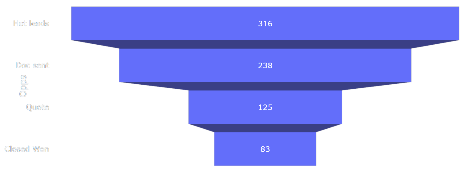
You can download the entire source code used in this section from the GitHub repository.Here is an example of how to visualize a typical Sales process, looking at how many sale opportunities make it through, from the number of leads down to the number of actual sales.
The data set is pretty simple:
data = {
    "Opps":  ["Hot leads", "Doc sent", "Quote", "Closed Won"],
    "Visits": [316, 238, 125, 83]
}
So from 316 leads, the company could retain 238 document exchanges, then 125 quotes. Finally, 83 opportunities were converted to actual close deals.
In a Taipy funnel chart, the type of stage must be stored in the y property, and the volume in the x property of the chart control:
Definition
<|{data}|chart|type=funnel|x=Visits|y=Opps|>
<taipy:chart type="funnel" x="Visits" y="Opps">{data}</taipy:chart>
import taipy.gui.builder as tgb
...
tgb.chart("{data}", type="funnel", x="Visits", y="Opps")
The resulting chart looks like this:
Multiple traces
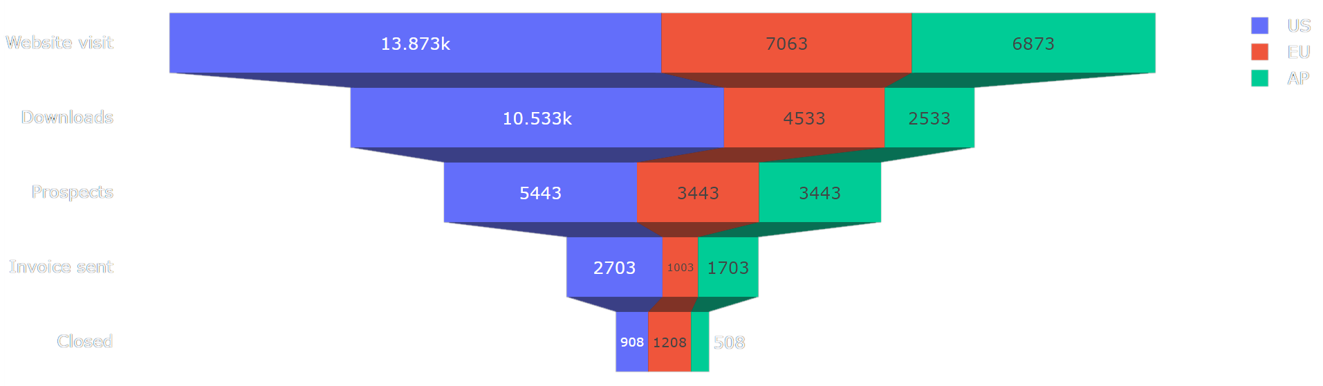
You can download the entire source code used in this section from the GitHub repository.With the previous example, we could spot how many contacts would convert to sales,
globally for a company.
We can split this information into Regions and get more detailed conversion
information.
In the following code, we have the same information spread across regions:
data = {
    # The stage names
    "Types": ["Website visit", "Downloads", "Prospects", "Invoice sent", "Closed"],
    # Volume for each stage, in the US
    "Visits_us": [13873, 10533, 5443, 2703, 908],
    # Volume for each stage, in the EU
    "Visits_eu": [ 7063, 4533, 3443, 1003, 1208 ],
    # Volume for each stage, in the AP region
    "Visits_ap": [ 6873, 2533, 3443, 1703, 508 ]
}

# Columns for each trace
x = ["Visits_us", "Visits_eu", "Visits_ap"]

# Legend text for each trace
names = ["US", "EU", "AP"]
x is an array of the entries in the data set that we use as the
value of the x property of the chart control.
It is a shortcut to setting each x[] value, where we
would have had to write, in the chart definition, the pretty long:
x[1]=Visits_us|x[2]=Visits_eu|x[3]=Visits_ap, and even longer in HTML.
The names variable holds all the trace names, so they appear properly in the chart legend.
Definition
<|{data}|chart|type=funnel|x={x}|y=Types|name={names}|>
<taipy:chart type="funnel" x="{x}" y="Types" name="{names}">{data}</taipy:chart>
import taipy.gui.builder as tgb
...
tgb.chart("{data}", type="funnel", x="{x}", y="Types", name="{names}")
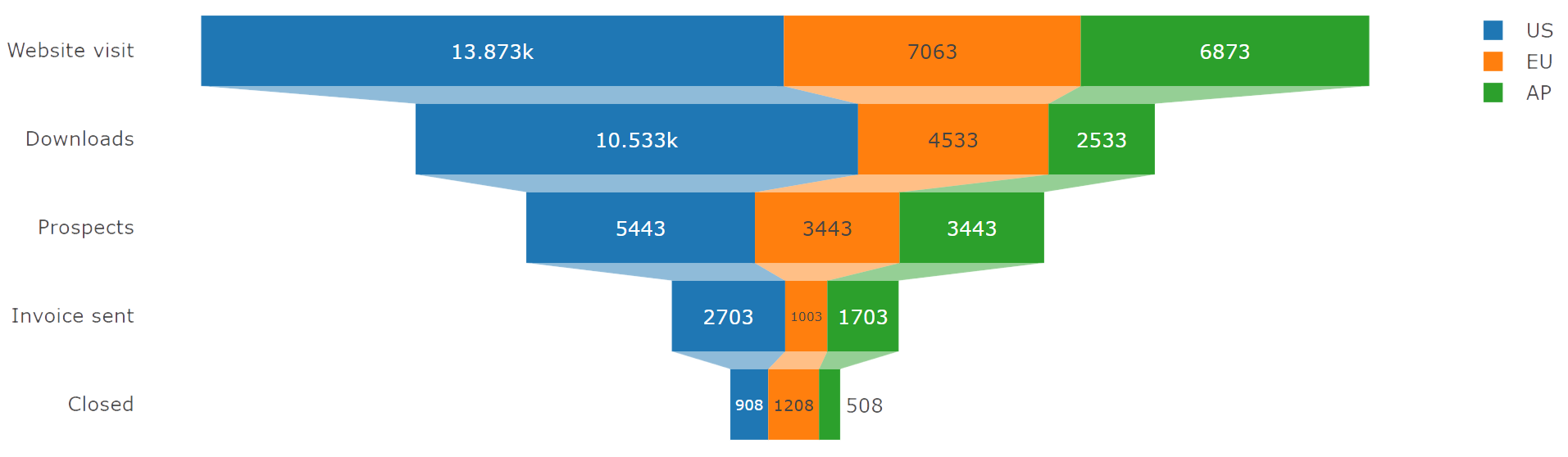
The resulting chart looks like this:
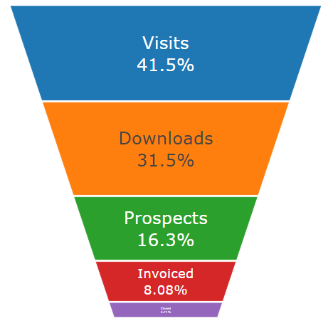
Styling
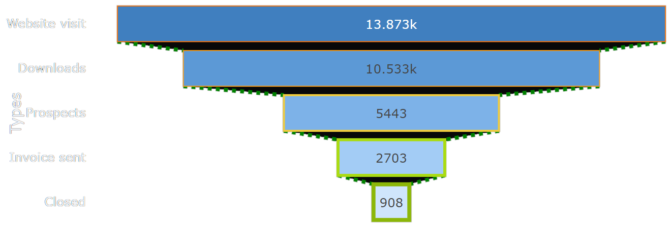
You can download the entire source code used in this section from the GitHub repository.Taipy lets you customize how the funnel chart elements can be styled.
To indicate how bars and lines should look, use the
marker and options properties
of the chart control.
Here is some code that shows how styling can be customized:
data = {
    "Types":  ["Website visit", "Downloads", "Prospects", "Invoice sent", "Closed"],
    "Visits": [13873, 10533, 5443, 2703, 908]
}

marker = {
    # Boxes are filled with a blue gradient color
    "color": ["hsl(210,50%,50%)", "hsl(210,60%,60%)", "hsl(210,70%,70%)", "hsl(210,80%,80%)", "hsl(210,90%,90%)"],
    # Lines get thicker, with an orange-to-green gradient color
    "line": {
        "width": [ 1, 1, 2, 3, 4 ],
        "color": ["f5720a", "f39c1d", "f0cc3d", "aadb12", "8cb709"]
    }
}

options = {
    # Lines connecting boxes are thick, dotted and green
    "connector": {
        "line": {
            "color": "green",
            "dash": "dot",
            "width": 4
        }
    }
}
The definition of the chart control references the two dictionaries that we have set up:
Definition
<|{data}|chart|type=funnel|x=Visits|y=Types|marker={marker}|options={options}|>
<taipy:chart type="funnel" x="Visits" y="Types" marker="{marker}" options="{options}">{data}</taipy:chart>
import taipy.gui.builder as tgb
...
tgb.chart("{data}", type="funnel", x="Visits", y="Types", marker="{marker}", options="{options}")
And here is how the resulting funnel chart is displayed:
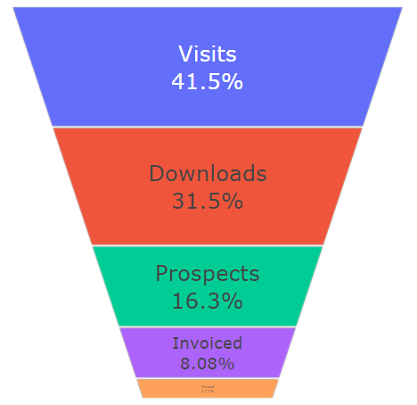
Funnel area chart
You can download the entire source code used in this section from the GitHub repository.A funnel area chart is a kind of funnel chart where boxes, instead of being represented
as rectangles, appear as stacked trapezoids.
The width of the funnel area, as it narrows, indicates the percentage of global volume
at each stage of the process.
To have Taipy create a funnel area chart, we must set the chart
type to "funnelarea" and set the funnel property of
layout to "stack".
Also note that, in the chart control definition, the stage names are set to
the text property, and the stage volumes are set
to values (instead of y and
x).
Here is some code that demonstrates how to create a funnel area chart with Taipy:
data = {
    "Types":  ["Visits", "Downloads", "Prospects", "Invoiced", "Closed"],
    "Visits": [13873, 10533, 5443, 2703, 908]
}

layout = {
    # Stack the areas
    "funnelmode": "stack",
    # Hide the legend
    "showlegend": False
}
Notice that, in the chart control definition, the stage names are set to the text property and the stage volume values are set to values:
Definition
<|{data}|chart|type=funnelarea|values=Visits|text=Types|layout={layout}|>
<taipy:chart type="funnelarea" values="Visits" text="Types" layout="{layout}">{data}</taipy:chart>
import taipy.gui.builder as tgb
...
tgb.chart("{data}", type="funnelarea", values="Visits", text="Types", layout="{layout}")
The funnel area chart we just created looks like this:
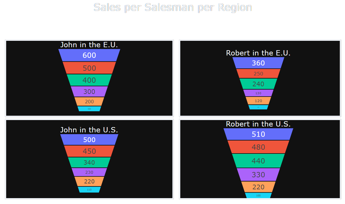
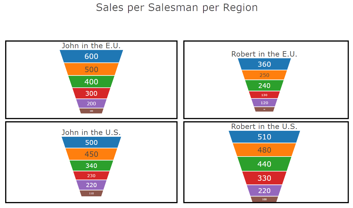
Multiple funnel charts
You can download the entire source code used in this section from the GitHub repository.You can create a chart control that represents several funnel charts: Taipy lets use of the domain property set to the definition of a location box in the options property of the control.
Here is a complete example where we display, in the same chart, a funnel area chart for two sales pipes, in two regions, resulting in four traces being generated:
data = {
    "John_us": [500, 450, 340, 230, 220, 110],
    "John_eu": [600, 500, 400, 300, 200, 100],
    "Robert_us": [510, 480, 440, 330, 220, 100],
    "Robert_eu": [360, 250, 240, 130, 120, 60],
}

# Values for each trace
values = ["John_us", "John_eu", "Robert_us", "Robert_eu"]

options = [
    # For John/US
    {
        "scalegroup": "first",
        "textinfo": "value",
        "title": {
            # "position": "top",
            "text": "John in the U.S."
        },
        # Lower-left corner
        "domain": {"x": [0, 0.5], "y": [0, 0.5]}
    },
    # For John/EU
    {
        "scalegroup": "first",
        "textinfo": "value",
        "title": {
            # "position": "top",
            "text": "John in the E.U."
        },
        # Upper-left corner
        "domain": {"x": [0, 0.5], "y": [0.55, 1]}
    },
    # For Robert/US
    {
        "scalegroup": "second",
        "textinfo": "value",
        "title": {
            #"position": "top",
            "text": "Robert in the U.S."
        },
        # Lower-right corner
        "domain": {"x": [0.51, 1], "y": [0, 0.5]}
    },
    # For Robert/EU
    {
        "scalegroup": "second",
        "textinfo": "value",
        "title": {
            # "position": "top",
            "text": "Robert in the E.U."
        },
        # Upper-right corner
        "domain": {"x": [0.51, 1], "y": [0.51, 1]}
    }
]

layout = {
    "title": "Sales per Salesman per Region",
    "showlegend": False,
    # Draw frames around each trace
    "shapes": [
        { "x0": 0,    "x1": 0.5, "y0": 0,    "y1": 0.5 },
        { "x0": 0,    "x1": 0.5, "y0": 0.52, "y1": 1 },
        { "x0": 0.52, "x1": 1,   "y0": 0,    "y1": 0.5 },
        { "x0": 0.52, "x1": 1,   "y0": 0.52, "y1": 1 }
    ]
}
The options array holds the settings for each trace. In particular, see how the domain property defines an area within the overall chart area where this specific trace should be rendered.
Definition
<|{data}|chart|type=funnelarea|values={values}|options={options}|layout={layout}|>
<taipy:chart type="funnelarea" values="{values}" options="{options}" layout="{layout}">{data}</taipy:chart>
import taipy.gui.builder as tgb
...
tgb.chart("{data}", type="funnelarea", values="{values}", options="{options}", layout="{layout}")
This is the resulting chart: